.svg)


Produk hebat yang sama dengan wajah baru! HelloSign kini dikenali sebagai Dropbox Sign.
Back in May 2014, the Dropbox Sign website (like a lot of others) had a classic view layer consisting of templates, partials, vanilla CSS stylesheets, and a handful of supporting libraries like jQuery. This setup was simple to implement, universally understood, and at the time the original Dropbox Fax site was established in 2010 pretty much the standard way of doing things around the web.
However, as our platform grew in feature-set and complexity the frontend code began to accumulate signs of “technical debt.” A page that once contained only a handful of simple flows gradually evolved into an intimidating maze of jQuery event handlers and complex JavaScript logic. Each new commit felt like trouble was lurking in hidden places, and even changes that should have been simple became a chore. Not surprisingly the QA time required to deploy new front-end features likewise increased.
Meanwhile, JavaScript technologies were advancing rapidly and a number of new approaches were gaining momentum, all of which promised a better way of doing things. We decided a little research was warranted to better understand our options.
Our initial discovery effort involved us looking at a few popular technologies such as Backbone, Knockout, and Angular but for various reasons none of them seemed like a good fit. But then we noticed a relative newcomer on the front-end scene: a small library from Facebook called React.
At first glance React looked like a lightweight frontend library that focused specifically on the view layer and was generally unopinionated on surrounding technologies. It also appeared to be an excellent choice for writing drop-in replacements (i.e. refactoring code in pieces) for those pages that we weren’t ready to entirely re-write.
Enter React
React brought a number of innovative ideas to the table and it was remarkably easy to pick up. While some frameworks like Angular and Meteor emphasized “two-way data binding” React encouraged the developer to write code in which data flows in only one direction (from parent to child).
While this might seem like it could be inconvenient, it does have the remarkable advantage of being easy to debug and reason about. Finding where data changes occur usually is a simple matter of finding usages for “setState” which (in a vanilla React implementation) will always be set explicitly. Note: it’s also possible to implement implicit two-way data bindings in React using helpers).
Another innovative feature is the JSX syntax which is how React blends markup and javascript together into a high-level abstraction. It’s a departure from classic unobtrusive JavaScript; but the creators argued that separation-of-technologies is actually not the same thing as separation-of-concerns. The syntax seemed a little strange at first but it was hard to argue with the practicality of the end-result: portable interactive components which contained within them everything needed to declaratively render on a page.
Speaking of rendering, React does it with a nifty trick. It maintains an in-memory virtual DOM and when updates to the real DOM are required, it calculates a diff and a kind of “shortest path” so that expensive update operations can be minimized.
The technology was impressive; but we felt even more strongly drawn to the development philosophy. The idea of breaking components up into their constituent parts and nesting them within each other opened up a whole world of possible design patterns. The virtual DOM and JSX syntax were cool, but this composability idea was what really got our interest piqued. After all, the core design philosophy seemed aimed at solving many of the same problems we were facing in maintaining unwieldy separate technologies and javascript files - we were impressed.
We decided to design a first simple composable component to see how it would look in our dev stack.
Composable Buttons
Much has already been written about how to use React, so we won’t recreate a tutorial here. But just for context it’s important to know that data exists in one of two forms: props and state.
Props are passed from parent to child and don’t change directly as a result of user interaction. State on the other hand does change with user interaction and a common pattern is to allow the state of the parent component determine the props which ultimately get passed down to its children. It’s a declarative approach with both data types combined governing how the component will render at any given moment.
With the basic thought process in mind, let’s dive into a real example to see how we used React to create composable buttons to use in our new design. The first step was to create a base type to provide all the functionality that every button would share. This might remind you a bit of object-oriented programming and indeed the basic tenets are similar: encapsulation and inheritance.
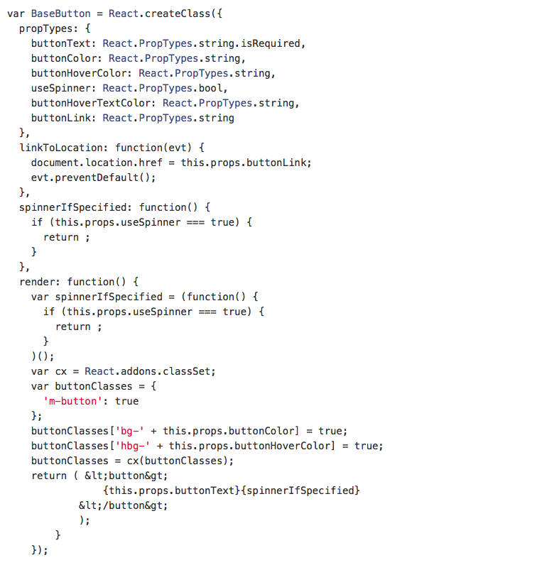
If we wanted we could extend this in other ways to include things like dimensions and corner style, but this is a great starting point. Now, whenever we need to place a button, we could use this BaseButton and specify all of its styling including text, background-color, hover-color, and font-color.
A better approach would be to create a higher-level abstraction which has the pre-defined settings for the specific types of buttons that we use in our style guide for example a “GreenButton” and a “BlueButton.” This should help enforce consistency and reduce repetition.
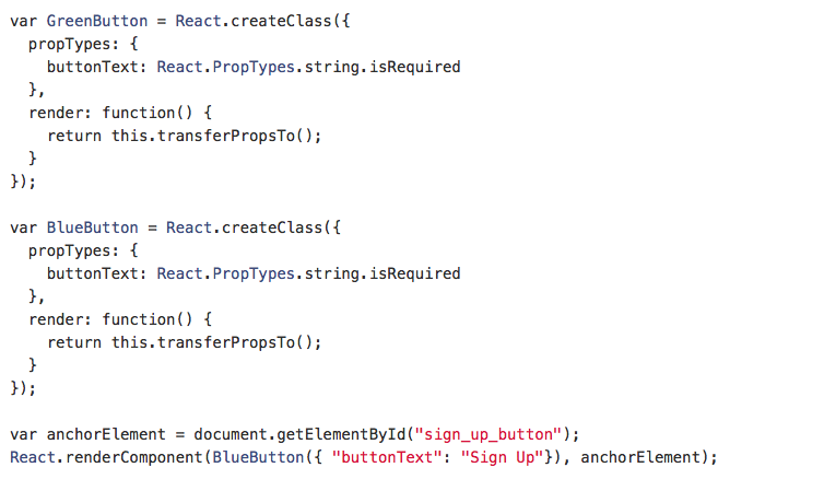
Now, a quick lookup in our internal style guide should be all that’s required to understand the visual forms possible and the limited props required to make each one work correctly. If a new variation is desired, the groundwork has already been laid to accommodate it. Best of all, we’re confident that using React for this functionality is faster and less-error prone than the way we had done things before.
Composable Modals
Our new design also makes liberal use of popup modals for important user actions. One reason we like the modal approach is it feels less disruptive for things like logging in and signing up a new account. In these moments we want our customers to easily see their origin in the background and be able to return to it by simply closing the modal.
For the basic styling we’re using Foundation’s Reveal, but for control and behavior we again turned to React. In this case we wanted to build a base modal component which defined all the shared functionality including open/close triggers and required DOM attach points. We also wanted the content to be interchangeable and ideally for them to work in a non-modal context as well.
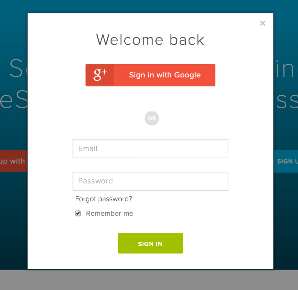
Here is an example of a ModalTrigger component which will launch a modal when fired. It accepts the basic props to build the modal itself and also looks for a separate passed in component to render the content (TriggerContent).
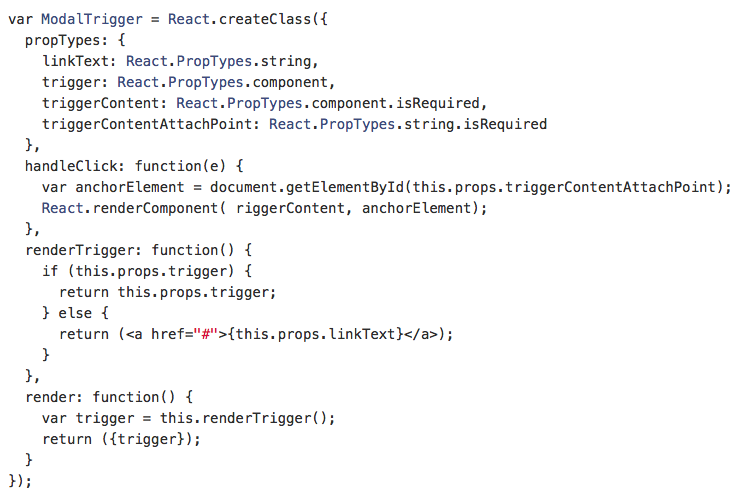
The TriggerContent component will vary but can include things such as the “CreateAccount” form and the “Credit card Payment” form. For reference here’s a slimmed down gist of our “CreateAccount” component which also doubles as a login form and could be used for the TriggerContent prop.
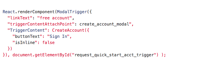
Now we can render BaseModal component and pass as a prop the CreateAccount component. This will give us the content in modal form.
And the result:
Alternatively, we can use the “isInline” property (which conditionally apply CSS rules) allowing the modal to appear within the normal flow of the page. All other functionality remains the same including form validation, submission, and the overall responsive design.
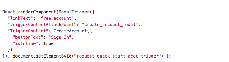
Which renders like so:

A different kind of trigger
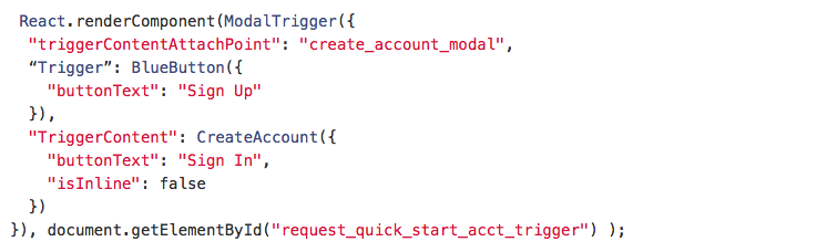
You may have noticed that we have a “Trigger” prop which is optionally passed into our ModalTrigger. If not present we’ll use anchor text but in many cases it would look a lot nicer to use a button instead. So as a final example, here is how we might utilize the “BlueButton” component we built previously to act as the trigger. This really illustrates how React's composability makes it so powerful, versatile, and fun to work with.
Looking ahead
Overall our first experience using React was a positive one. We’re planning to use the knowledge we gained from this effort and apply it toward future redesign and development efforts (including our internal pages, stay tuned!). We’re also looking forward to continue working with React to support cleaning up old code while simultaneously adding new features to support our expanding user base.
Also on the horizon for us will likely be the inclusion of a model layer to better manage data flow from the backend to the frontend. Some have chosen to implement Backbone alongside React for just this purpose while others have gone a different route and used an accompanying Facebook library called Flux.
Regardless of which approach we take, the lines of abstraction in our front-end stack have been drawn and future improvements seem easily within reach.We hope you enjoyed this brief foray into how we used React to level-up our frontend code.
If you liked this article make sure to check out the next two parts where we'll talk about styling and our internal developer workflow.
If you’re a developer and this stuff speaks to you on a deeper level give us a shout, we’re hiring.If you want to hop into our API documentation, visit here.
Kekalkan penglibatan
Thank you!
Thank you for subscribing!


